고정 헤더 영역
상세 컨텐츠
본문
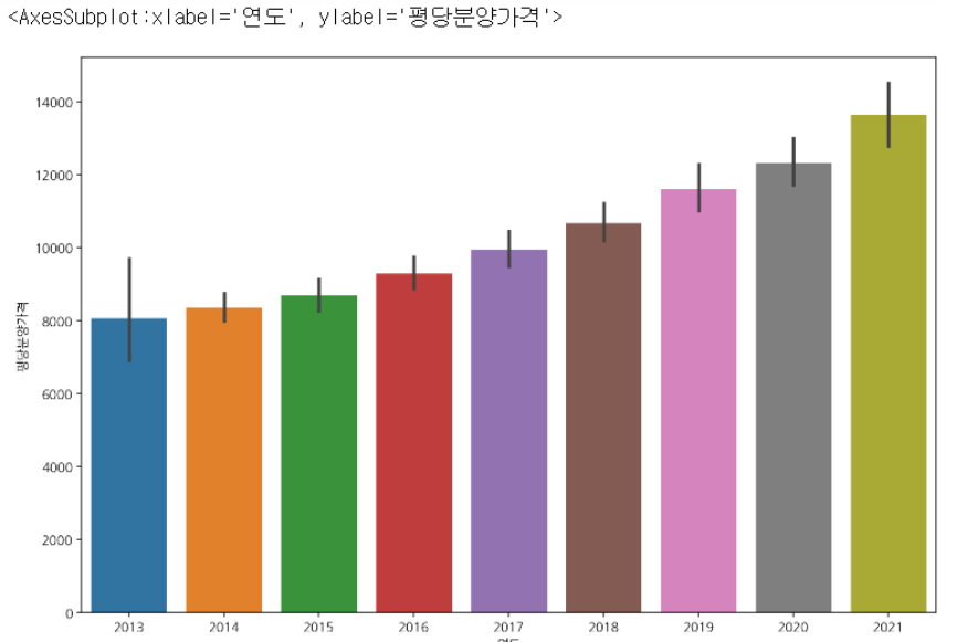
1. x = 범주형 변수, y = 수치형변수 일 때
barplot
plt.figure(figsize=(12,8))
sns.barplot(data = df, x="연도", y="평당분양가격")
pointplot
plt.figure(figsize=(12,8))
sns.pointplot(data = df, x="연도", y="평당분양가격")

boxplot
plt.figure(figsize=(12,8))
sns.boxplot(data = df, x="연도", y="평당분양가격")

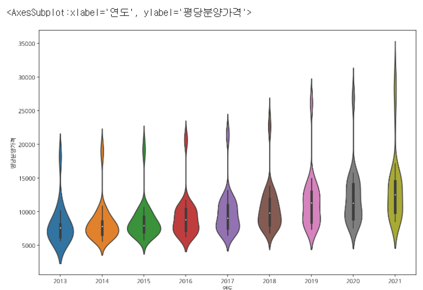
violinplot
plt.figure(figsize=(12,8))
sns.violinplot(data = df, x="연도", y="평당분양가격")
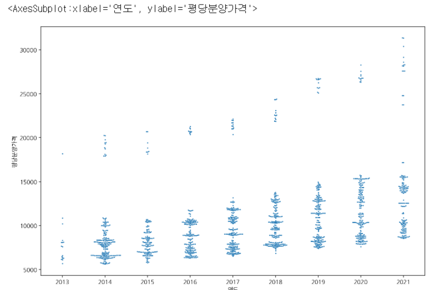
swarmplot
plt.figure(figsize=(12,8))
sns.swarmplot(data = df, x="연도", y="평당분양가격")
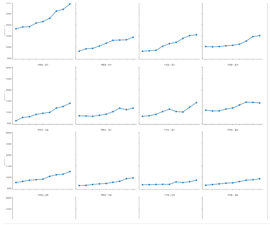
catplot: 서브플롯 그리기
sns.catplot(data=df[~df.index.duplicated()], x="연도", y="평당분양가격", col="지역명", col_wrap=4, kind="point", ci=None)
2. 하나의 범주형변수에 대한 빈도수 시각화
- 월별 처방횟수를 시각화해보자
- ‘월’은 데이터가 있으나, 처방횟수는 데이터 컬럼이 없다. 따라서 sns.countplot으로 시각화한다.
plt.figure(figsize=(15, 6))
sns.countplot(data = df, x = "월")
판다스로는 아래와 같이 그릴 수 있다.
df["월"].value_counts().sort_index().plot(kind="bar", rot=0)

3. 두개의 범주형변수에 대한 시각화
연령대별, 성별 처방수를 출력하려면 seaborn의 hue를 사용한다.
plt.figure(figsize=(20, 6))
sns.countplot(data = df.sort_values("연령대코드(5세단위)"), x = "연령대", hue="성별")

'멋사 AISCOOL 7기 Python > INPUT' 카테고리의 다른 글
| [머신러닝] INTRO. Definition, Tool, 알고리즘 유형 (0) | 2022.11.17 |
|---|---|
| 시각화 총정리: plotly (1) | 2022.10.28 |
| Boolean Indexing (0) | 2022.10.28 |
| [데이터 집계] pd.crosstab, pivot table, group by (0) | 2022.10.28 |
| 빈 날짜 채우기, 누적 합 구하기 (0) | 2022.10.28 |


