고정 헤더 영역
상세 컨텐츠
본문
import pandas as pd
import numpy as np
import seaborn as sns

# 0.11.0 버전에서 변화가 많으니 이 버전 이상을 사용해 주세요.
!pip install seaborn --upgrade
# 0.11.2

#seaborn에 내장되어 있는 데이터 셋을 가져옴
df = sns.load_dataset("mpg")
- df.head()와 df.tail()은 iloc[:5], iloc[-5:]로 작동함
- 주석처리 ctrl + /
# 추상화된 도구를 통한 기술통계구하기
Pandas Profiling
!pip install pandas-profiling==3.1.0

from pandas_profiling import ProfileReport
profile = ProfileReport(df, title="Pandas Profiling Report MPG")

# 주피터 노트북이 있는 위치에 html파일이 생성됩니다.
profile.to_file("pandas_profile_report.html")
Sweetviz
!pip install sweetviz

import sweetviz as sv
my_report = sv.analyze(df)

my_report.show_html()
- 타겟변수 없이 그릴 수도 있고 타겟변수를 지정할 수도 있습니다.
- 타겟변수는 범주형이 아닌 수치, bool 값만 가능합니다.
- 데이터에 따라 수치형으로 되어있지만 동작하지 않을 수도 있습니다.
Autoviz(car var plot, distplots, violinplots, heatmaps, pairscatter): bokeh로 시각화해주는 추상화된도구
!pip install autoviz

from autoviz.AutoViz_Class import AutoViz_Class
AV = AutoViz_Class()

filename = "<https://raw.githubusercontent.com/mwaskom/seaborn-data/master/mpg.csv>"
sep = ","
dft = AV.AutoViz(
    filename,
    sep=",",
    depVar="",
    dfte=None,
    header=0,
    verbose=0,
    lowess=False,
    chart_format="html",
#     chart_format="bokeh",
    max_rows_analyzed=150000,
    max_cols_analyzed=30,
#     save_plot_dir=None
)
- 이런 도구를 이용하게 되면 기본적이고 반복적으로 봐야하는 기술통계값을 한번에 보여주고, 시각화해주는 장점이 있음
- 자료의 형태(데이터타입)에 따라 기술통계값이 다르게 나타남
- 수치형데이터의 경우 막대그래프로 표현하면 값이 너무 많아 구분이 힘드므로,히스토그램으로 수치형데이터의 범위를 나눠서 그림
- x축이 범주형데이터, y축이 수치형데이터인 경우 수치형데이터의 y축값은 평균으로 표현됨
- 이런 추상화된 도구를 사용하게 되면 단점? 가장 큰 이유는 대용량 데이터에 사용하기 어렵다는 단점이 있다.
# 직접 EDA하기
- 요약하기: 데이터의 개수, 형태를 간략히 알 수 있음
df.info()
- 결측치보기
df.isnull().sum()
- 결측치 비율 구하기
df.isnull().mean()
- len과 shape함수는 결측치까지 모두 포함해서 세는 것이고, count함수로 컬럼 별 개수는 결측치를 포함하여 셈
- 결측치 시각화
plt.figure(figsize = (12, 8))
sns.heatmap(df.isnull(), cmap = "gray")

- plt.colotmaps()
- 시각화할 때 나타낼 수 있는 색상을 알 수 있음
print(plt.colormaps())
- 기술통계량
df.describe()

#범주형데이터에 대한 기술통계값
df.describe(include = "object")

# 범주형데이터이나 수치형데이터로 인식되어서 기술통계값이 추출 된 경우
# 데이터 타입을 변경하고 기술통계값 추출
df[["cylinders", "model_year"]].astype(str).describe()
# 수치형변수의 EDA 및 시각화
- 데이터 타입을 구분하는 방법
- unique변수 추출: 개수가 작으면 범주형일 확률이 높음
df.nunique() # 컬럼별 유일값 추출 # 수치형 변수 mpg의 unique 값 보기 df["mpg"].unique()- 히스토그램: df.hist(figsize = (12, 8), bins = 50) -> 막대개수를 조정하면 그래프 모양이 달라짐,연속적인 막대그래프가 나타나지 않는다면 범주형일 확률이 높음
df.hist(figsize=(12, 8), bins = 40)
plt.show()

- 비대칭도(왜도): df.skew()
# skew를 통해 전체 수치변수에 대한 왜도 구하기
df.skew()

df.skew().sort_values() #정렬
- 첨도: df.kurt()
# kurt를 통해 전체 수치변수에 대한 첨도 구하기
df.kurt()

df.kurt().sort_values(ascending=False)
# 수치형변수 “mpg” 1개에 대한 EDA 및 시각화
- describe 로 mpg의 기술통계 값 구하기
df["mpg"].describe()
- “mpg”에 대해 agg로 왜도 및 첨도 구하기
df["mpg"].agg(["skew", "kurt", "mean", "median"])
- displot을 통해 히스토그램과 kdeplot 그리기
sns.displot(data = df, kde = True)

sns.displot(data = df, x = "mpg", kde = True)

sns.displot(data = df, x = "mpg", kde = True, hue = "origin", col = "origin")


- kdeplot, rugplot으로 밀도함수 표현하기
sns.kdeplot(data = df, x = "mpg")
sns.rugplot(data = df, x = "mpg")

- boxplot 으로 mpg 의 사분위 수 표현하기
sns.boxplot(data = df, x = "mpg")

- violinplot 으로 mpg 값 좀 더 자세히 보기
sns.violinplot(data = df, x = "mpg")

- boxplot과 kdeplot
- 전체 변수에 대한 시각화를 나타낼때 전체 변수의 표준편차가 모두 다르기 때문에 스케일링을 통해 범위를 맞춰줄 필요가 있음.
#스케일링: 표준화
df_num = df.select_dtypes(include = "number")
df_std = (df_num - df_num.mean()) / df_num.std()
df_std.describe().round(2)
sns.violinplot(data = df_std)

# 수치형변수 “mpg”와 “horsepower”에 대한 EDA 및 시각화
- scatterplot 을 통해 2개의 수치변수 비교하기
sns.scatterplot(data = df, x = "mpg", y = "horsepower")

- regplot 으로 회귀선 그리기
sns.regplot(data = df, x = "mpg", y = "horsepower")

- residplot으로 회귀선의 잔차를 시각화 하기
sns.residplot(data = df, x = "mpg", y = "horsepower")

regplot과 residplot의 차이?
- reg의 직선이 resid의 0축으로 바뀌었다.
- 그래서 회귀선에서 값이 얼마나 떨어져 있는지 오차를 확인해 볼 수 있음
- 단 hue나 col이 없다는 단점이 있음, 그래서 lmplot을 사용함
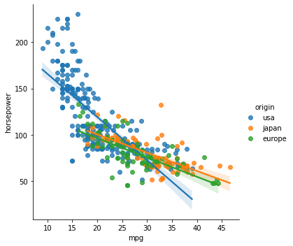
- lmplot 을 통해 범주값에 따라 색상, 서브플롯 그리기
sns.lmplot(data = df, x = "mpg", y = "horsepower", hue = "origin")

#col은 서브플롯을 그릴 수 있음
sns.lmplot(data = df, x = "mpg", y = "horsepower", hue = "origin", col = "origin")

- jointplot 2개의 수치변수 표현하기
sns.jointplot(data = df, x = "mpg", y = "horsepower", kind = "hex")

- pairplot
- 두 변수간의 나타낼 수 있는 그래프를 모두 보여줌, 단 시간이 너무 오래 걸려서 일부 데이터만 가져와서 보고싶을 때 사용
sns.pairplot(data = df.sample(100))

# origin 값에 따라 다른 색상으로 그리기
sns.pairplot(data = df.sample(100), hue = "origin" )


- lineplot
sns.lineplot(data = df, x = "model_year", y = "mpg")

- relplot
- 두 변수간의 관계를 표현하며, 주로 col을 이용해 서브 그래프를 그릴려고함
sns.relplot(data = df,x = "model_year", y = "mpg", hue = "origin", col = "origin" )

# relplot 의  kind 옵션을 통해 선그래프를 그립니다.
sns.relplot(data = df,x = "model_year", y = "mpg", hue = "origin", col = "origin" , kind = 'line', ci = None)


# 상관분석
- 상관계수 구하기
df.corr()
- 시각화
# heatmap 을 통해 상관계수를 시각화 합니다.
sns.heatmap(corr, cmap = "coolwarm")
sns.heatmap(corr, cmap = "coolwarm", annot=True) #annot은 숫자 나타남의 유무

mask = np.triu(np.ones_like(corr))

#mask로 상삼각에서 1로 표시된 행열들을 모두 지움
sns.heatmap(corr, cmap = "coolwarm", annot=True, mask = mask)
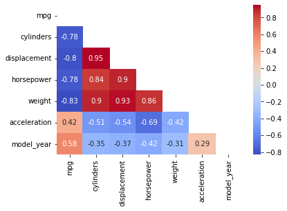
- 상관관계가 높다고 해서 인과관계가 높다는 것은 아니다.
'멋사 AISCOOL 7기 Python > INPUT' 카테고리의 다른 글
| [크롤링] FinanceDataReader, 네이버금융 뉴스기사 크롤링 (0) | 2022.09.28 |
|---|---|
| [EDA] 범주형데이터 기술통계 및 시각화 (0) | 2022.09.28 |
| 1주차 과제 뒷풀이: 인덱싱은 리스트나 문자열만! (0) | 2022.09.22 |
| 앤스컴 콰르텟 (0) | 2022.09.22 |
| [시각화] Seaborn (0) | 2022.09.22 |


