[EDA] 범주형데이터 기술통계 및 시각화
https://seaborn.pydata.org/index.html
import pandas as pd
import numpy as np
import seaborn as sns
import matplotlib.pyplot as plt

df = sns.load_dataset("mpg")
# 기술통계
- 범주형 변수에 대한 기술통계
df.describe(include = "object")
: 범주형 데이터의 경우 데이터타입이 꼭 object가 아니라 int, float, bool일 수 있음
- 범주형, 수치형 모두 기술통계보기
df.describe(include = "all")
- df.describe(exclude = “”)
df.describe(exclude = "object") # = df.describe()
- df.describe(include = “ “)
df.describe(include = np.int64)
# 범주형변수의 유일값, 빈도수
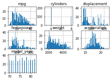
nunique값과 히스토그램으로 범주형데이터임을 확인해 볼 수 있다.
- 히스토그램
df.hist(bins = 50)
plt.show()
- nunique
df.nunique()
unique() 는 오류, series에만 사용가능하며, nunique()는 데이터프레임, 시리즈 모두 가능
df['cylinders'].unique()
df['model_year'].unique()
df['origin'].unique()
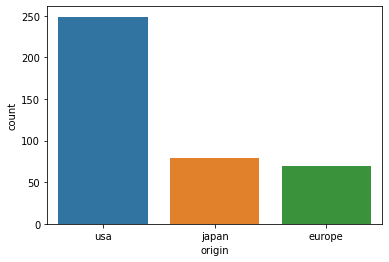
# 범주형 데이터 1개 변수의 빈도수 및 시각화
- 범주형 변수 빈도수 구하기
df["origin"].value_counts()
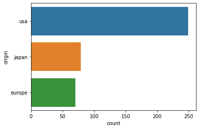
- countplot: 1개의 변수에 대하 빈도수를 표시할 때 사용하며, vertical한 방법이다.
#vertical
sns.countplot(data = df, x = "origin")

#horizontal
sns.countplot(data = df, y = "origin")
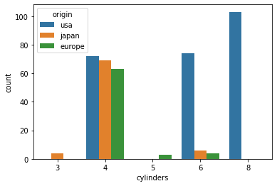
# 범주형 데이터 2개 변수의 빈도수
- countplot
1개 변수의 빈도수와 또 다른 변수의 빈도수를 hue를 사용해 나타낼 수 있음
sns.countplot(data = df, x = "origin", hue = "cylinders")
- pd.crosstab
시각화한 값을 직접 구할 수 있다.
pd.crosstab(index = df["origin"], columns = df["cylinders"])
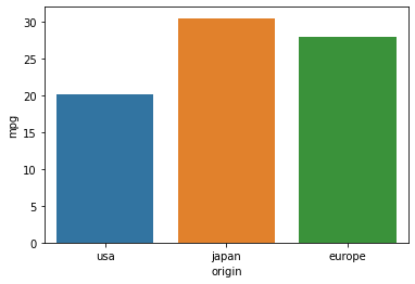
# 범주형 vs 수치형 변수
- barplot
# x가 범주형변수, y가 수치형변수
sns.barplot(data = df, x = "origin", y = "mpg", ci = None)
- y축의 기본값은 평균값
- 이것의 파라미터는 estimator = mean이다.
- 보편적으로 ci(신뢰구간)은 없애고 그리나, 데이터가 많으면 그냥 그리는게 속도가 더 빠름
# groupby 를 통한 연산
- origin 별 평균 구하기
df.groupby("origin").mean()
- origin별 mpg에 대한 평균 구하기
df.groupby("origin")["mpg"].mean()

# 얘는 데이터프레임 [[ ]]으로 결과값이 추출됨
df.groupby("origin")[["mpg"]].mean()
# pivot table 를 통한 연산
- groupby보다 더 직관적인 사용법, groupby를 추상화한 기능이라 볼 수 있음.
- origin 별 평균 구하기
pd.pivot_table(data = df, index = "origin") # = df.groupby("origin").mean()
- origin별 mpg에 대한 평균 구하기
pd.pivot_table(data = df, index = "origin", values = "mpg")
- 따로 aggfnc를 지정해주지 않으면 기본값은 mean이다.
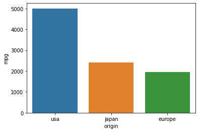
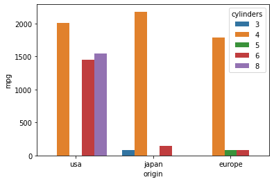
#origin, cylinder별 mpg합계구하기
- barplot으로 합계구하기
sns.barplot(data = df, x = "origin", y = "mpg", estimator = sum, ci = None)

#hue를 사용하여 색상을 다르게 표현하기
sns.barplot(data = df, x = "origin", y = "mpg", estimator = sum, hue = "cylinders", ci = None)
- Groupby를 통해 시각화한 값 데이터로 추출하기
df.groupby(["origin", "cylinders"])[["mpg"]].sum()

df.groupby(["origin", "cylinders"])[["mpg"]].sum().unstack()
- unstack(): 마지막 인덱스를 컬럼으로 끌어올리는 기능
- unstack(0)하면 첫번째 인덱스를 컬럼으로 끌어올림
- pivot table로 시각화한 값 데이터로 추출하기
pd.pivot_table(data = df, index = "origin", columns = "cylinders", aggfunc = sum)

pd.pivot_table(data = df, index = "origin", columns = "cylinders", values = "mpg", aggfunc = sum)
pd.pivot과 pd.pivot_table의 차이는?
- 연산을 하는지의 여부
- pivot은 형태만 끌어올림
- pivot_table은 연산이 가능함
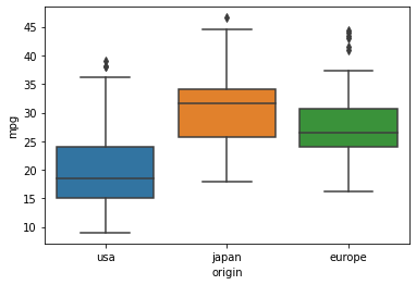
# 박스플롯과 사분위수
- boxplot 으로 origin 별 mpg 의 기술통계 값 구하기
sns.boxplot(data = df, x = "origin", y = "mpg")
- groupby로 origin 값에 따른 mpg의 기술통계 구해서, q3, q1, iqr, out_max, out_min을 구할 수 있음
desc = df.groupby("origin")["mpg"].describe()
eu = desc.loc["europe"]

# IQR, 이상치를 제외한 최댓값, 최솟값 구하기
Q3 = eu["75%"]
Q1 = eu["25%"]
IQR = Q3 - Q1
OUT_MAX = (1.5 * IQR) + Q3
OUT_MIN = Q1 - (1.5 * IQR)
Q3, Q1, IQR, OUT_MAX, OUT_MIN
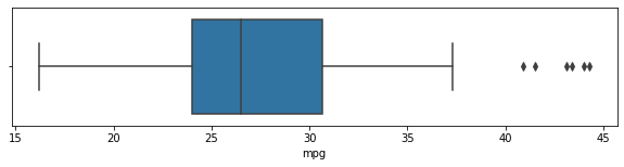
- europe 에 해당되는 값에 대한 그래프
# boxplot
plt.figure(figsize=(10,2))
sns.boxplot(data = df[df["origin"] == "europe"], x = "mpg")
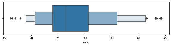
#boxenplot: boxplot 보완
plt.figure(figsize=(10,2))
sns.boxenplot(data = df[df["origin"] == "europe"], x = "mpg")
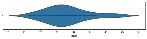
#violinplot: 위 두 그래프를 보완해서 그림, 히스토그램의 밀도를 추청한 kde플롯을 마주보고 그린 그래프
plt.figure(figsize=(10,2))
sns.violinplot(data = df[df["origin"] == "europe"], x = "mpg")
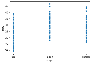
# 산점도를 통한 범주형 데이터 표현
- scatterplot
sns.scatterplot(data = df, x = "origin", y = "mpg")
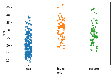
- stripplot
sns.stripplot(data = df, x = "origin", y = "mpg")
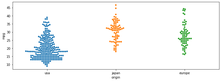
- swarmplot
plt.figure(figsize = (12, 4))
sns.swarmplot(data = df, x = "origin", y = "mpg")
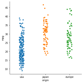
- catplot
sns.catplot(data = df, x = "origin", y = "mpg")
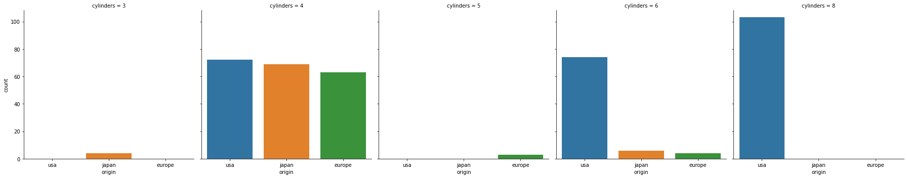
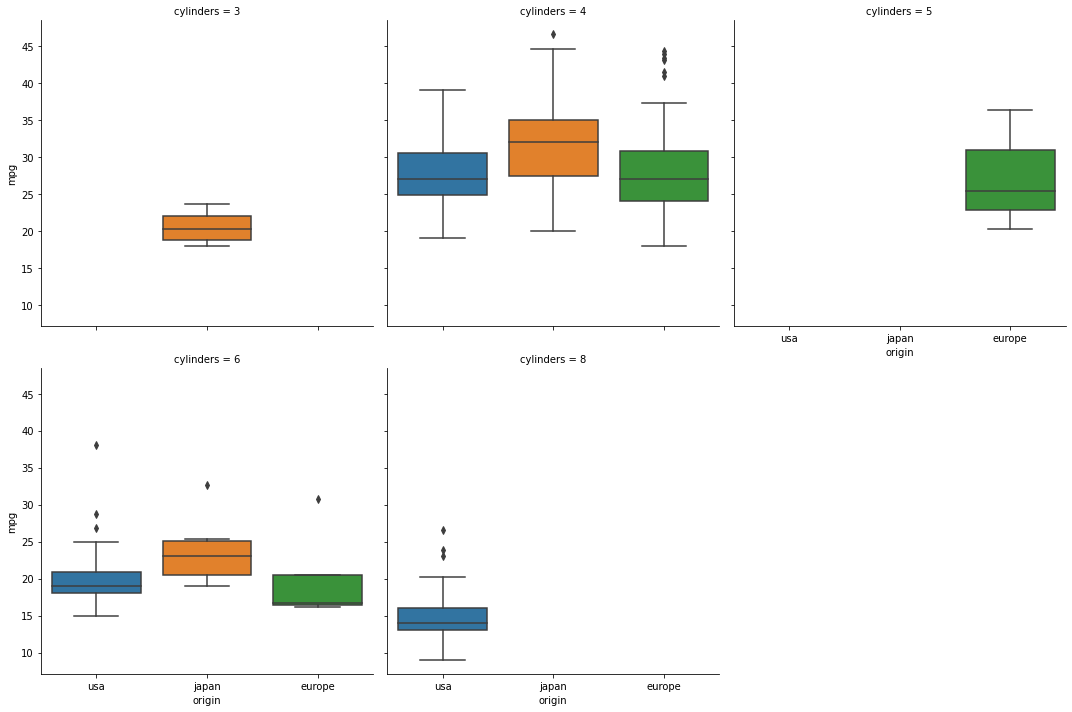
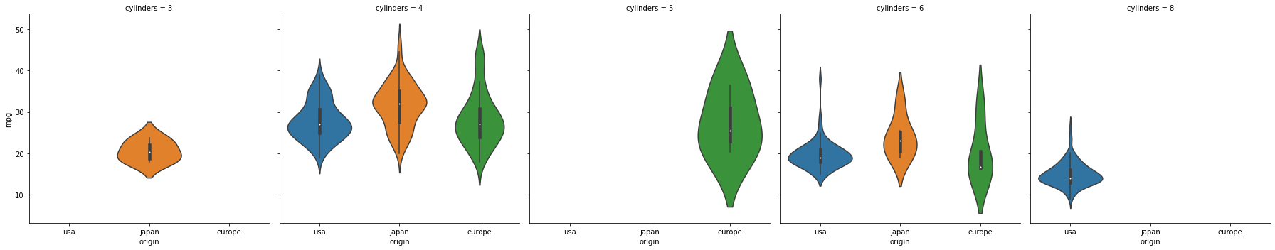
# catplot을 통한 범주형 데이터의 서브플롯 시각화
여러개의 서브플롯을 그리고 싶을 때 catplot을 사용함
- boxplot
sns.catplot(data = df, x = "origin", y = "mpg", kind = "box", col="cylinders", col_wrap = 3)
- violinplot
sns.catplot(data = df, x = "origin", y = "mpg", kind = "violin", col="cylinders")
- countplot
sns.catplot(data = df, x = "origin", kind = "count", col="cylinders")